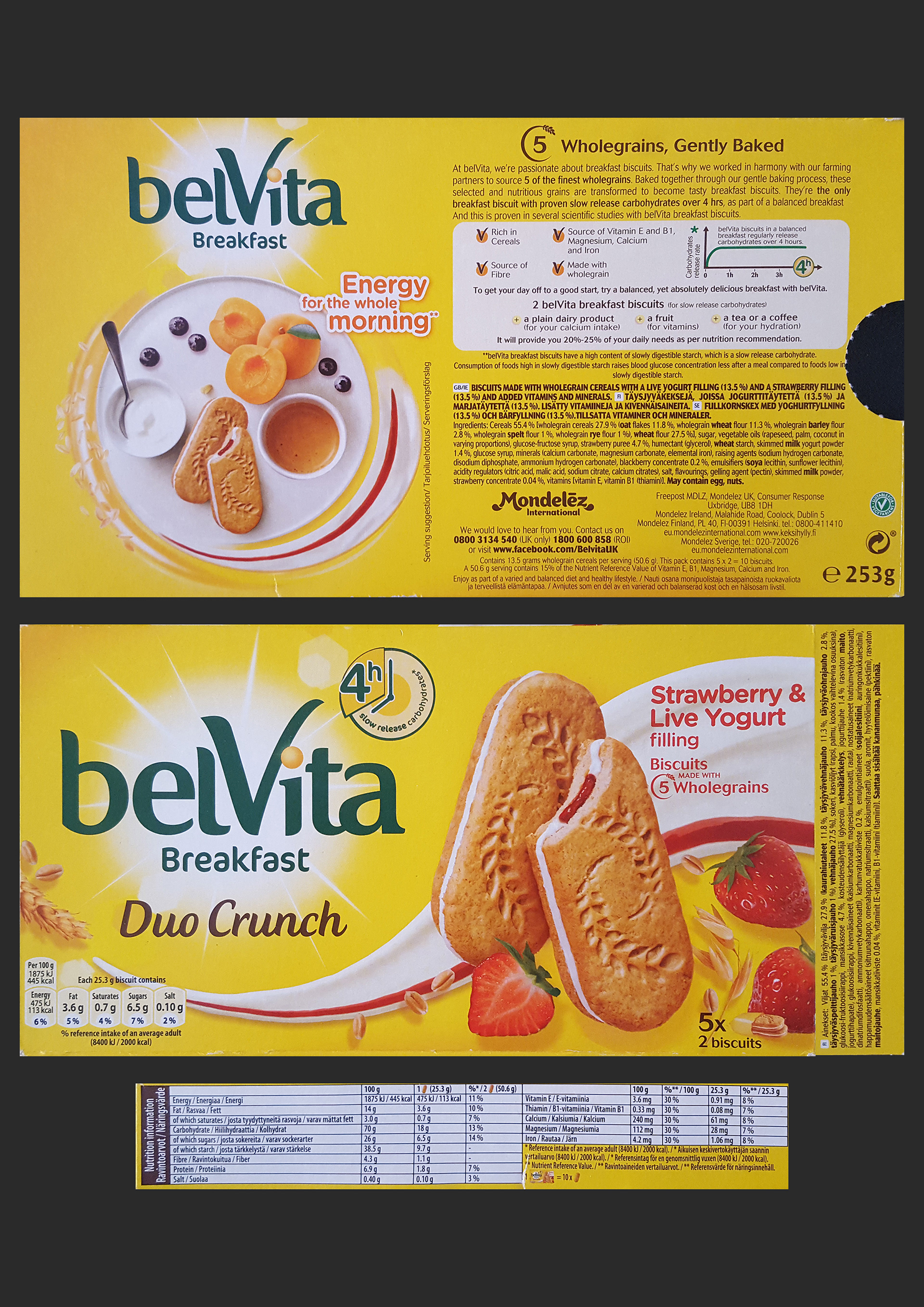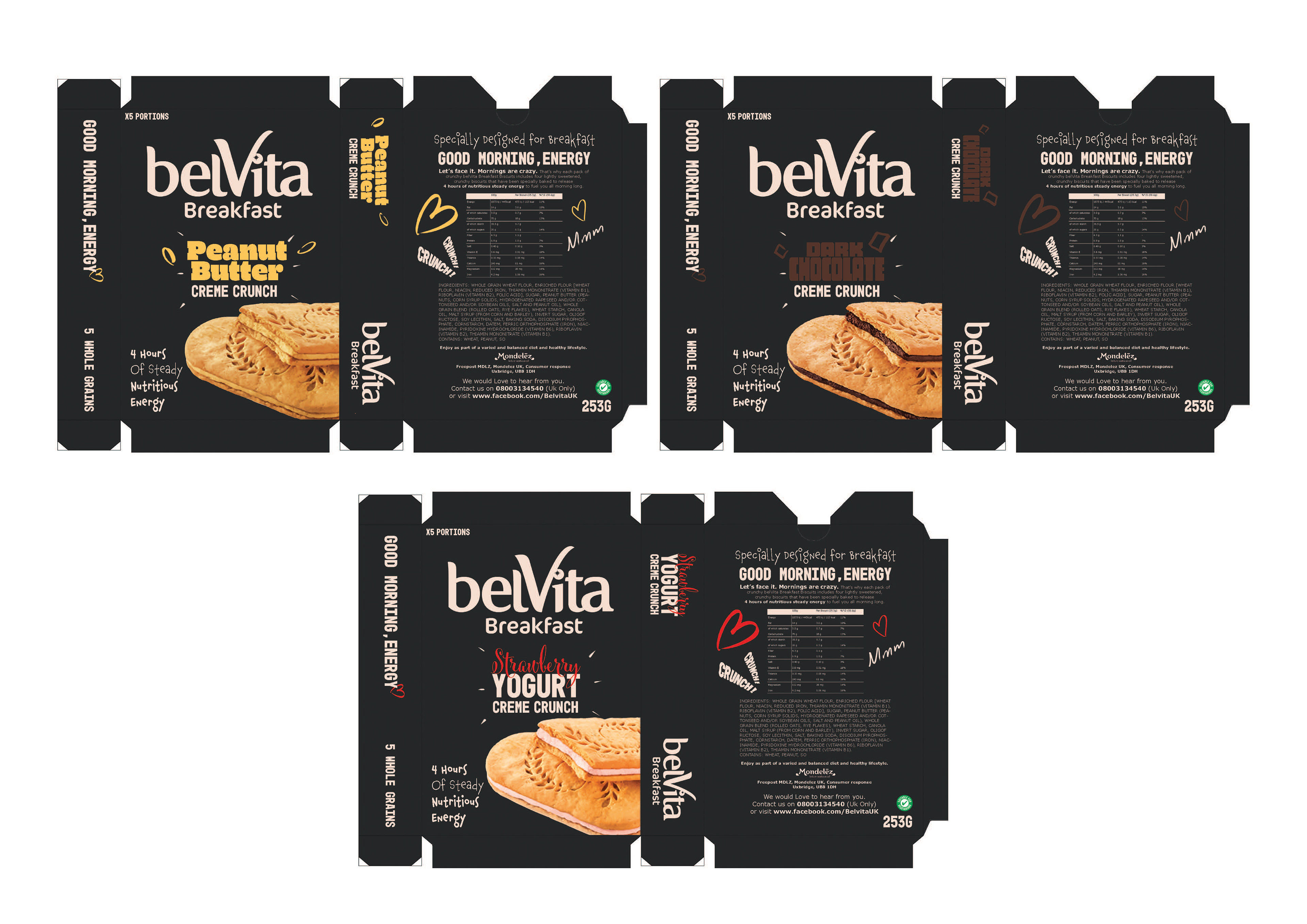
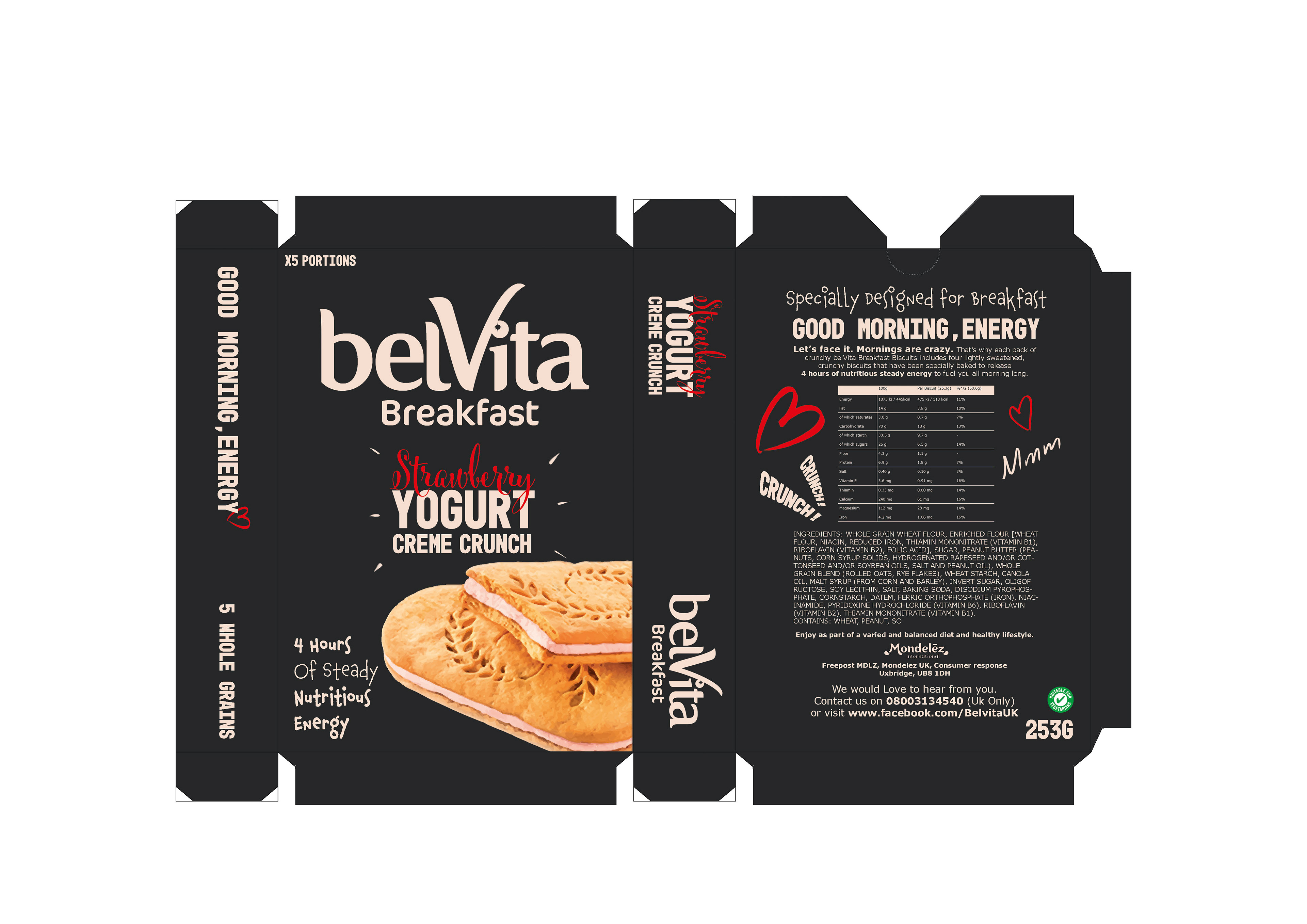
As shown below, the original Belvita boxes are quite bloated with text and images, which is one issue I attempted to address.
Another is how clinical the nutritional chart looks
Many design decisions are purely my preference - I don't like cheesy photoshopped breakfast compositions
as an example.
as an example.
My box is much darker, but the text is much brighter and emphasis is placed on the flavour colours and the biscuits themselves, I prefer this contrast over the original.
The project was a personal exercise in any case, no hate :)